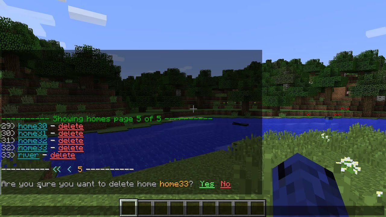
I set out to make /list commands better inside of sponge plugins, and this is what I have come up with so far:
You are welcome to try it out download the Destinations plugin.
You may also steal the source code. (MIT License)
Or track the progress of development.
Updates
Thanks for the great replies!
17 Likes
Holy shit. We need an applause emoji. That’s easily the most badass thing I’ve seen in a while.
3 Likes
Thanks Ferus! I appreciate it!
I can’t stop watching the video. It’s beautiful. ;_;
Wow, thats amazing. But sadly enough it would interfere with the chat tho  . Wouldn’t it be awesome to get like jline stuff to work in chat. Like split the chat with gui stuff and chat stuff
  .
.
I suppose that could be an option to not empty the chat when viewing the list.
Or better yet, save the chat history and restore it when you are done viewing the list 
4 Likes
@zml has proposed a pagination API for sponge FYI
2 Likes
That’s very cool and should ne a standalone Library or part of Sponge.
Two ideas:
- use the action bar
- replace the delete text with a trash icon
- always display all arrows in the bottom bar so they are always in the same position
I’d rather have this than chat anyday!
2 Likes
Cool.
offtopic, Where did you get your avatar?
1 Like
This is awesome, could be better formatted down by the next and previous page options, other than that, it’s great!
1 Like
As far as I know the action bar doesn’t allow line breaks 
Is it possible to add icons in chat widow?
I do plan on cleaning up the display on the pagination links.
Most of these work: http://blogs.christianpost.com/online/167-symbols-to-spice-up-your-twitter-and-facebook-updates-3981/
✗ – ballot X
✘ – heavy ballot X
✕ – multiplication sign X
 – heavy multiplication sign X
This is pretty slick and innovative. Job well done!
2 Likes
An idea that you could do is record the chat while the menu is displayed, and redirect it to the actionbar.
After the menu has finished displaying, replay the chat back at like, double speed or more until chat catches up with the buffered chat.
That way the user can get a preview of anything (private messages, tells, other alerts) on the action bar, and exit out quicker if needed.
The only change I would make is attempt to align the delete buttons, and add tooltips saying the location, or further details.
Another option could be to reserve the top few lines for chat messages, and rotate through the chat and reprint the menu as new chat messages come in.

 . Wouldn’t it be awesome to get like jline stuff to work in chat. Like split the chat with gui stuff and chat stuff
  .
.
